Intervention
Based on internal data, we targeted the top 3 most frequently ordered routine blood tests: complete blood count (CBC), creatinine, and electrolytes. Trainee interviews revealed that habit, bundled order sets, and fear of “missing something” contributed to inappropriate routine blood test ordering. Based on these root causes, we used the Model for Improvement to iteratively develop a multimodal intervention that began in July 2016.7,8 This included a change to the computerized provider order entry (CPOE) to nudge clinicians to a restrictive ordering strategy by substituting the “Daily x3” frequency of blood test ordering with a “Daily x1” option on a pick list of order options. Clinicians could still order daily routine blood tests for any specified duration, but would have to do so by manually changing the default setting within the CPOE.
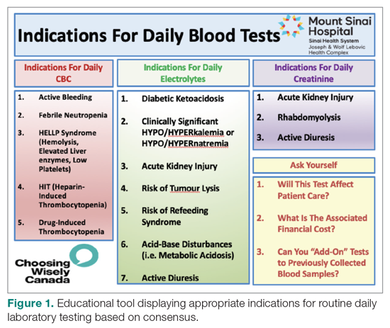
From July 2017 to March 2018, the research team educated residents on appropriate laboratory test ordering and provided audit and feedback data to the clinicians. Diagnostic uncertainty was addressed in teaching sessions. Attending physicians were surveyed on appropriate indications for daily laboratory testing for each of CBC, electrolytes, and creatinine. Appropriate indications (Figure 1) were displayed in visible clinical areas and incorporated into teaching sessions.9
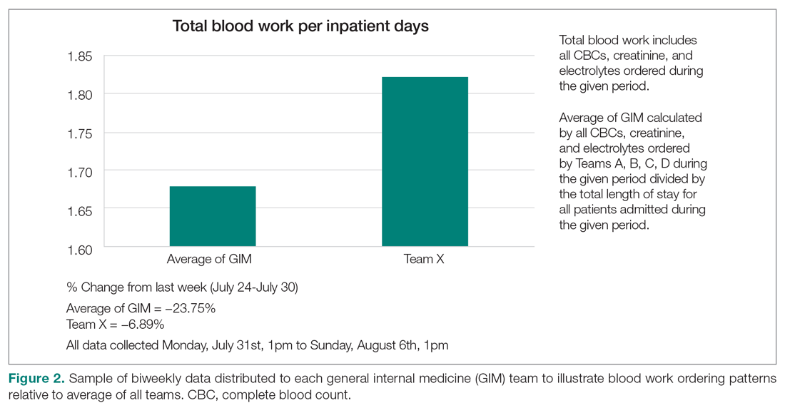
Clinician teams received real-time performance data on their routine blood test ordering patterns compared with an institutional benchmark. Bar graphs of blood work ordering rates (sum of CBCs, creatinine, and electrolytes ordered for all patients on a given team divided by the total LOS for all patients) were distributed to each internal medicine team via email every 2 weeks (Figure 2).1,10-12
Data Collection and Analysis
Data were extracted from the hospital electronic health record (EHR). The primary outcome was the number of routine blood tests (CBC, creatinine, and electrolytes) ordered per inpatient day. Descriptive statistics were calculated for demographic variables. We used statistical process control (SPC) charts to compare the baseline period (April 2016-June 2017) and the intervention period (July 2017-March 2018) for the primary outcome. SPC charts display process changes over time. Data are plotted in chronological order, with the central line representing the outcome mean, an upper line representing the upper control limit, and a lower line representing the lower control limit. The upper and lower limits were set at 3δ, which correspond to 3 standard deviations above and below the mean. Six successive points above or beyond the mean suggests “special cause variation,” indicating that observed results are unlikely due to secular trends. SPC charts are commonly used quality tools for process improvement as well as research.13-16 These charts were created using QI Macros SPC software for Excel V. 2012.07 (KnowWare International, Denver, CO).
The direct cost of each laboratory test was acquired from the hospital laboratory department. The cost of each laboratory test (CBC = $7.54/test, electrolytes = $2.04/test, creatinine = $1.28/test, in Canadian dollars) was subsequently added together and multiplied by the pre- and post-intervention difference of total blood tests saved per inpatient day and then multiplied by 365 to arrive at an estimated cost savings per year.


