From the Center for Dermatology Research, Department of Dermatology, Wake Forest School of Medicine, Winston-Salem, North Carolina.
The Center for Dermatology Research is funded by Galderma Laboratories, LP. The authors report no conflict of interest.
Correspondence: Steven R. Feldman, MD, PhD, Wake Forest Baptist Medical Center, Department of Dermatology, 4618 Country Club Rd, Winston-Salem, NC 27104 (sfeldman@wakehealth.edu).
Educating patients about the risks of treatment is obligatory. An inherent problem with risk education is that patients can become terrified of rare risks associated with the treatment, resulting in possible treatment refusal, poor adherence, and continued disease symptoms. Such fears are a common obstacle observed with the use of biologic medications to treat psoriasis. In this article, we use graphical presentation of psoriasis safety data to illustrate how patients subjectively interpret objective information. Different ways of presenting safety data graphically include the use of truncated, full, and inversed y-axes, resulting in certain likely perceptions by the patient. Despite a physician’s best intentions to give a patient objective information, patients will subjectively interpret objective safety data. Therefore, when presenting information, whether in the form of numerical descriptions or graphical presentations, the physician must use his/her best judgment to determine how to present safety data to patients to ensure their well-being and properly inform them about their treatment options.
Physicians can guide patients’ perceptions of drug safety by the way safety data are presented.
For patients who are concerned about rare treatment risks, presenting data on the patients who have not experienced adverse effects can be reassuring.
References
The Nuremberg Code in 1947,1 the Declaration of Helsinki in 1964,2 and the Belmont Report in 19793 were cornerstones in the establishment of ethical principles in the medical field. These documents specifically highlight the concept of informed consent, which maintains that to practice ethical medicine, physicians must fully inform patients of all therapeutic benefits and especially risks as well as treatment alternatives before they consent to therapeutic intervention. Educating patients about risks of treatment is obligatory. Risk communication involves a mutual exchange of information between physicians and patients; the physician presents risk information in an understandable manner that adequately conveys pertinent data that is critical for the patient to make an informed therapeutic decision.4
An inherent problem with risk education is that patients may be terrified about risks associated with treatment. Some patients will refuse needed treatment because of fear.5 When patients have concerns about the safety profile of a treatment regimen and potential adverse effects, they may be less compliant with treatment.6 The intelligent noncompliance phenomenon occurs when a patient knowingly makes the choice to not adhere to treatment, and concern regarding treatment risks relative to benefits is a common reason underlying this phenomenon.7,8
Behavioral economists have studied how individuals weigh risks. Kahneman and Tversky’s9 prospect theory asserts that individuals tend to overweigh unlikely risks and underweigh more certain risks, which they call the certainty effect; it is the basis of the human tendency to avoid risks in situations of likely gain and to pursue risks in situations of likely loss. The tendency to overweigh rare risks is even more pronounced for affect-rich events such as serious side effects.10 The way data are presented can affect how patients interpret the information. Context and framing of data affect patients’ perceptions.11 We describe several ways to present safety data using graphical presentation of psoriasis treatment safety data as an example and explain how each one can affect patients’ perception of treatment risks.
Approaches to Presenting Safety Data
There are numerous ways to present safety data to patients, including verbal, numeric, and visual strategies.12 Many methods of presentation are a combination of these strategies. Graphs are visual strategies to further categorize and present numeric data, and physicians may choose to incorporate these aids when presenting safety information to patients. Graphical presentations give the patient a mental picture of the data. Numerous types of graphs can be constructed. Kalb et al13 determined the effect of psoriasis treatment on the risk of serious infection from the Psoriasis Longitudinal Assessment and Registry (PSOLAR). We used the results from this study to demonstrate multiple ways of presenting safety data (Figures 1–3).
A graphical presentation with a truncated y-axis is a common approach (Figure 1). Graphs with truncated axes are sometimes used to conserve space or to accentuate certain differences in the graph that would otherwise be less obvious without the zoomed in y-axis.14 These graphs present quantitatively accurate information that can be visually misleading at the same time. Truncated axes accentuate differences, creating mental impressions that are not reflective of the magnitude of the numeric differences. Alternatively, a graph with a full y-axis includes both the maximum and minimum data values on the y-axis (Figure 2). The y-axis also extends maximally to the total number of patients or patient-years studied. This type of graph presents all of the numeric data without distortion.
Figure 1. Cumulative incidence of serious infections during psoriasis treatment with a truncated y-axis. This graph accentuates the visual appearance of risk differences. By not including the full range of possible patient-year values on the y-axis, the height of each bar promotes a visual perception of risk out of proportion to the true magnitude. Data from Kalb et al. 13
Figure 2. Cumulative incidence of serious infections during psoriasis treatment with a full y-axis. This graph has a y-axis that includes the entire potential data range, providing a visually accurate picture of the magnitude of the risk and the relative differences between groups. Nevertheless, humans tend to put too much weight on rare risks. Data from Kalb et al.13
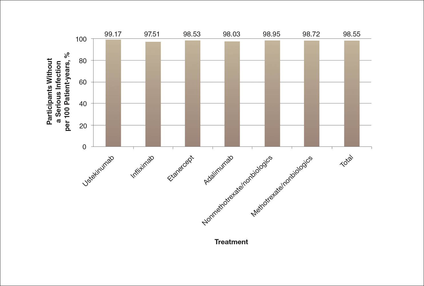
A graph also can present the percentage of patients or patient-years that do not have an adverse effect (Figure 3). This inverse presentation of the data does not emphasize rare cases of patients who have had adverse effects; instead, it emphasizes the large percentage of patients who did not have adverse effects and presents a far more reassuring perspective, even though mathematically the information is identical.
Figure 3. Percentage of patients without a serious infection during 1 year of psoriasis treatment with a full y-axis. This graph with a full y-axis presents the full potential range of the risk of serious infection. Although this graph is mathematically identical to the data presented in Figure 1, this inverse presentation of the data is likely to give the visual impression that there is very little difference in risk between the treatments and to be the most reassuring to a patient. Data from Kalb et al.13